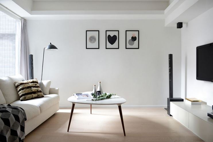
Here are some of the most common mistakes made in interior design. By knowing them and keeping an eye on these issues, you will be able to find them in your designs and remove them.
1. TOO MUCH FURNITURE
One of the most common mistakes people make in interior design is too much furniture. Although it may look nice on drawings, when you enter a room with too much furniture, you will immediately feel cramped. No matter what type of room you’re designing, make sure that every piece of furniture has its purpose. Also, make sure that it can be used properly.
You can start with the most important furniture when designing a room. Once you have found the right location for that furniture, try building around it. This is how you will create balance and flow in your room.
2. HOW FURNITURE COMES TOGETHER?
Besides, you should also consider how furniture comes together. Using design elements creates movement and space. After putting these elements in place, highlight them by adding artworks and composing objects. Combine categories, colors, and textures to enhance your space.
Remember that arranging furniture and clashing furniture together can make the whole room much smaller. The large pieces of your room also need to fit together and create a foundation that you can build with different colors and styles.
3. STACKING FURNITURE AGAINST THE WALL ONLY
Most furniture is designed to be put against a wall, and it didn’t even have any finish on the back. This has created a habit for many people, where they always put furniture against the wall.
If you do this, you risk creating lots of dead space in the middle of every room. Fortunately, there is a wide selection of furniture that can be placed anywhere, even in the middle of the room. Also, when you place elements next to a wall, make sure to leave a few inches between them.
This creates a more open and inviting feel to the whole area. Feel free to experiment with furniture placement, as you can completely change the layout of the space and give it that fresh look.
4. CHECK THE SCALE
Scale and proportion are also very common mistakes in interior design. Decorating a whole space with a lot of different elements can be difficult, and even designers slip up and forget about the scale. Apart from adding different elements of different sizes and simply not being able to work well together, people often put too many things in a room.
Another mistake people make is putting bulky and large elements in the room. This will make the room look small and stuff. It’s important to combine the right sizes, heights, and shapes to create a good scale.
It can be really difficult to find proportion and scale on your own, especially if you have no experience in interior design. You should leave this part to the professionals, but make sure to remind them about this important aspect of interior design.
5. UNBALANCED HEIGHT
Interior designers have a thing called “height clearance”, which refers to the height of different furniture and fixtures which need to be used daily. For example, it’s very important that your dining table and the chairs are aligned in height so that people can sit properly and eat comfortably.
Leg clearance is also important – it helps ensure that people can move properly and helps you avoid scratching different elements against each other. If you have a coffee table in front of your sofa, make sure that it’s low enough so that people can reach their cups and comfortably enjoy their morning routine.
This rule also applies when getting a nightstand. Make sure that you can reach it easily and put away anything with ease. When it comes to height, take special care of the kitchen, as this area needs to be functional above all else.
6. POOR NAVIGATION
As we have mentioned many times so far, every room needs to be functional and fulfill its purpose. The key here is navigation. You need to think about whether people can easily navigate the room and do everything they want. Regarding navigation, furniture is probably the most confusing element.
Poor furniture arrangements can confuse people, making them unsure of where they should walk and how to find their way around the room. You can look at the choice of furniture and location separately. Always consider the type of furniture you will receive based on the plan of the room.

