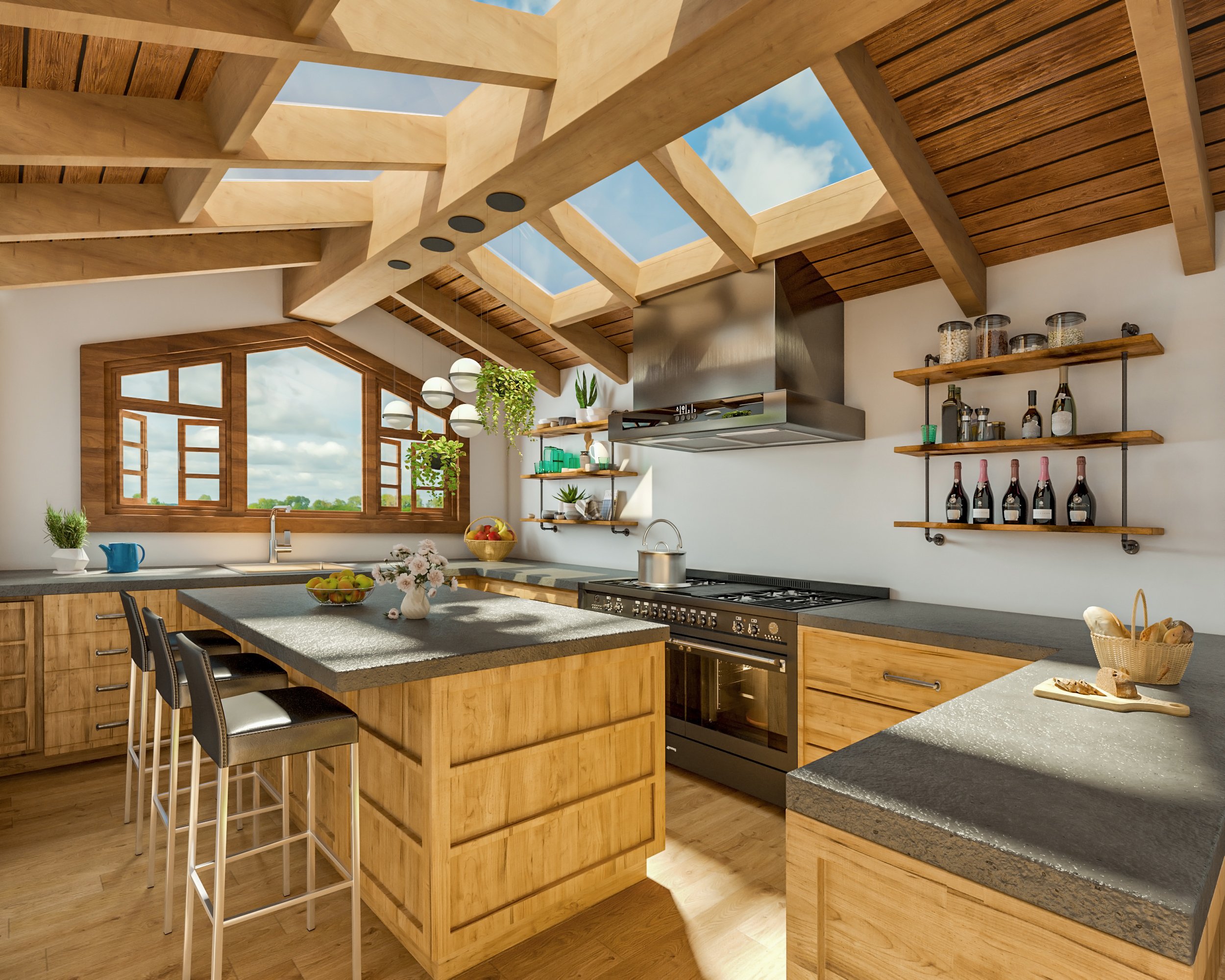
Architectural visualization has been constantly evolving since the development of computer-generated three-dimensional objects in the ‘70s. Today, renderings are lively through intelligent color combinations, detailed textures, beautiful lighting, and by the addition of true-to-life scenarios. The process of visualization has evolved into a combination of modeling and dramatization of architectural elements of the buildings and its environment to produce astonishing images of the proposed building as though this is real. In this article, these are some architectural visualization styles that most architects, designers, and artists use.
1. Sketching and Watercolor Style
This technique is a simple duplication of the processes in sketching. The artist use pencil drawing styles in creating structures and the processes of painting by adding colors, lighting, and shading like the watercolor method. It leverages the fusion of different color combinations, the use of space, and textures to deliver this powerful aesthetic message to the viewer.
The artist know how to put color combinations, textures, and lighting and shadowing into the right control. These matched with the correct background. So, they will be able to transform plain renderings to fancy-looking images.
2. The Mad Max
This style gives the buildings a certain glow… literally. You can often see it used for representing designs of opera houses, stadiums, arenas, skyscrapers, large shopping malls, and so on.
The Mad Max style is used for rendering the exterior of the objects. So that, the renders should not only focus on the building itself, but they should incorporate the surroundings as well to help the viewer see how the objects fit in.
If you are working on a large-scale project and you have to innovate, Mad Max can help you create powerful and compelling 3D renders. Also, if your objects feature cutting-edge technology, this is the style to go with.
3. The Theodore
When it comes to interior representations, it doesn’t get better than it does with Theodore. The name comes from Spikes Jonze’s “Her” and the character Theodore played by Joaquin Phoenix.
Characterised by diffused lighting, bright backgrounds, and an abundance of airy spaces, the Theodore style is one of the best styles you can use to represent interiors. The use of warm tones and natural lights create a relaxing and inviting space. Good effects such as lighting and angling of the lens will enhance the feel of the visualizations.
Because of that, this style is great for 3D renders of shopping malls, big office buildings, spacious living rooms, halls of corporate establishments, bus and train stations, libraries, and airports.
4. Whodunnit
If your focus is on modern architectural designs, the Whodunnit style might have all the answers that you need.
The Whodunnit uses low saturation, cold tones and a high contrast. This add emphasis to strong design features, angular shapes and modern materials. Descended from the gritty, high violence of the noir detective genre, this style of architectural visualization lends itself to urban developments, large-scale projects and modern minimalism.
So, what does this actually achieve? If you apply this to your renders, you will see how it affects the aesthetics of the end results. The modern materials get their place under the spotlight. Strong design features become more prominent, and angular shapes become more visible.
5. The Katherine Heigl
As opposed to the Whodunit style, the Katherine Heigl style uses a high saturation of colours, over-lighting, and an abundance of background characters to create romance and an idealistic scene. This has to be the most vibrant of all the architectural visualization styles as it uses very attractive architectural components.
Its focus revolves around emphasising two things; equating the design to a high quality of life and happiness, and that the design integrates naturally into its surroundings. Therefore, this style is particularly useful for the representations of buildings that are planned in the urban areas.
6. The Gondry
Gondry will make each one of your renders unique and incredibly attractive. This 3D architectural render done in this style appears as a collage as well. It consists of numerous photos, drawings, 3D objects rendering, and other elements, all working together to generate a unique feel of the interior.
It can be used when designing modern and luxurious homes, office buildings, restaurants, bars, and clubs. The fusion of different elements can help you create just the atmosphere that you like and communicate the intended emotion with ease.
7. Authentic Photo-Realistic Style
The photo-realistic style of rendering allows clients to have the best estimation of how their project would look once construction is done. This style mainly aims to produce photo-perfect and realistic renders. Its control of contrast and saturation makes the colors look life-like. The lighting and shadows are very natural looking and it perfectly matches the light of the background. The post-processing of the renderings are so fine-tuned and carefully performed that it takes more time than the software rendering itself. The results of this architectural visualization style are so life-like that it seems as though the building already exists.
Choosing a style is more than just picking the one that grabs your eye the most. Your design needs to communicate the narrative of the space, rather than just what it will look like, and using one of the above styles is one of the easiest ways to do that. For all your digital illustration and animation needs—be it interior, exterior, or animation and virtual tours—contact Home3ds and let us know how we can help you.

